Check-in flow improvements
Increasing success rate
BACKGROUND
Checkin is one of the most stressful moments in the user journey. Users are extra cautious to fill in their personal details, slightly anxious about which seat they will be assigned to.
Check-in is an opportunity to reassure and reduce the tension by easing the flow, which is in fact exists only due to old-fashioned technologies and operational necessities.
Use-case 1
Initial flow consisted only from few steps, after which users were landing on the top task page, from where they would have options to download their boarding pass, check where they were seated, amount of luggage and buy extra options. The end however did no bring closure to users and they felt confused.
Check-in flow
Old flow
Passenger details
Dangerous
Goods
Goods
Boarding Pass
Seatmap
Baggage allowance
Other extra options
Passenger details
Dangerous
Goods
Goods
Seatmap
Baggage allowance
Offer
New flow
RESULT
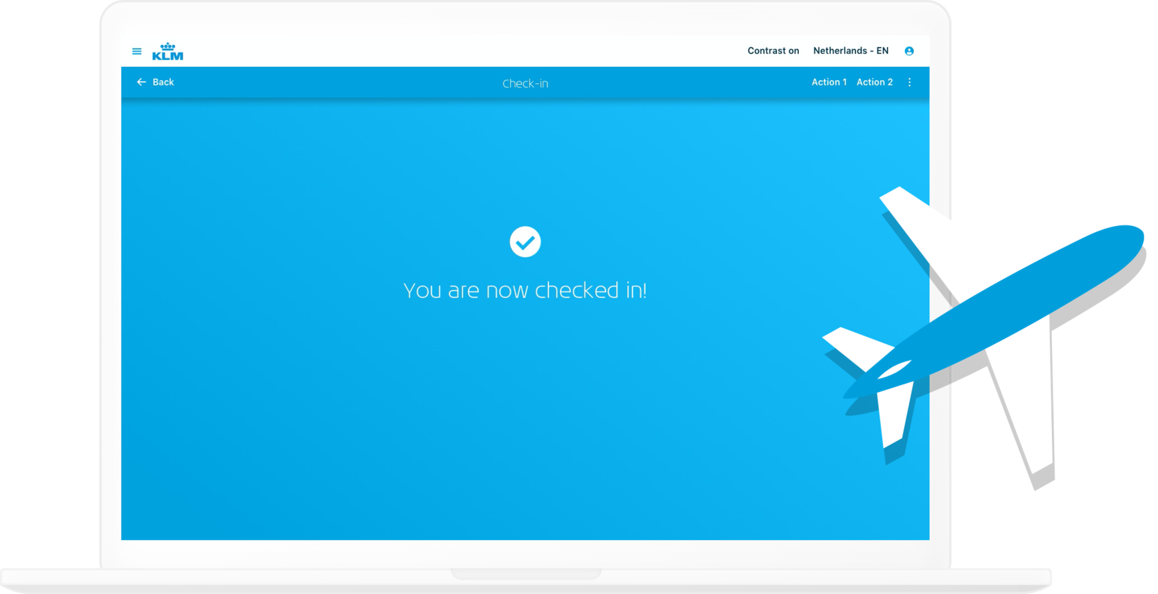
We've added several extra steps to the flow, made the 'success of checkin' more explicit and added a link to trip overview page.
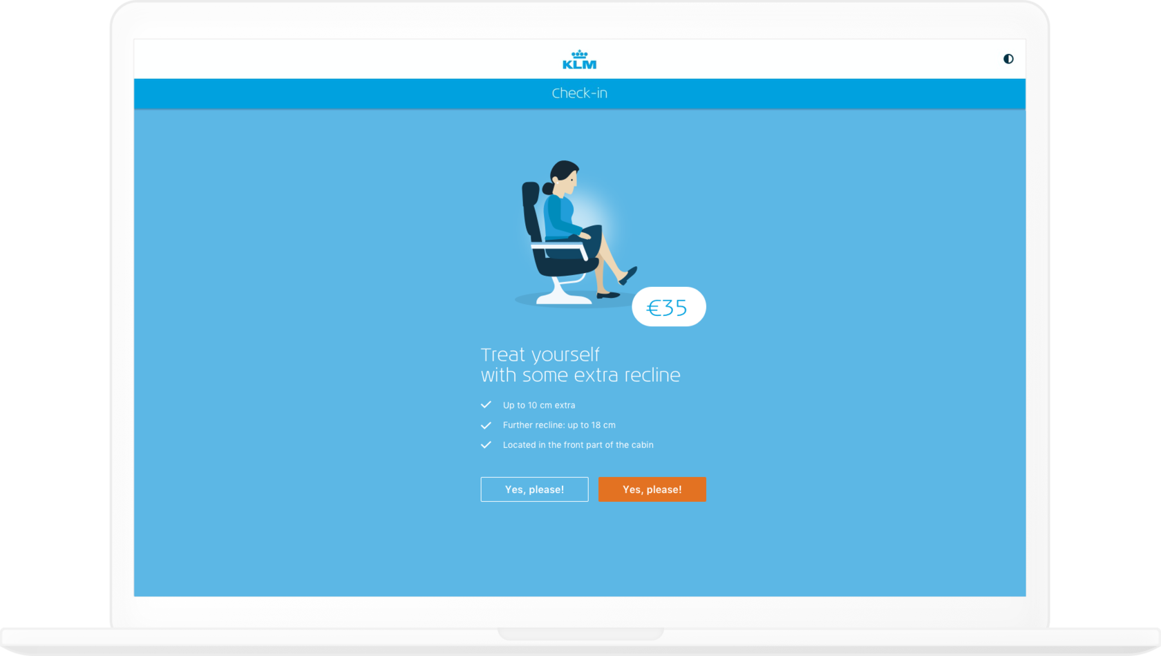
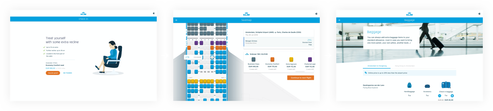
Even though few steps were added, they were perceived as a reassuring part of the flow, as seat allocation is closely associated with a check-in process and at the last moment users as well check their baggage allowance in order to decide whether they are going to fit everything in their suitcase or buy an extra piece.
RESULT
We've added several extra steps to the flow, made the 'success of checkin' more explicit and added a link to trip overview page.
Even though few steps were added, they were perceived as a reassuring part of the flow, as seat allocation is closely associated with a check-in process and at the last moment users as well check their baggage allowance in order to decide whether they are going to fit everything in their suitcase or buy an extra piece.
Use-case 2
When checking in users have to enter their document details. This is the moment when they are both cautious and concentrated. So we shall make this step both easy to have a 'bird' overview and yet not to create cognitive overload. And complexity shall not arise with number of passengers.
Passenger details
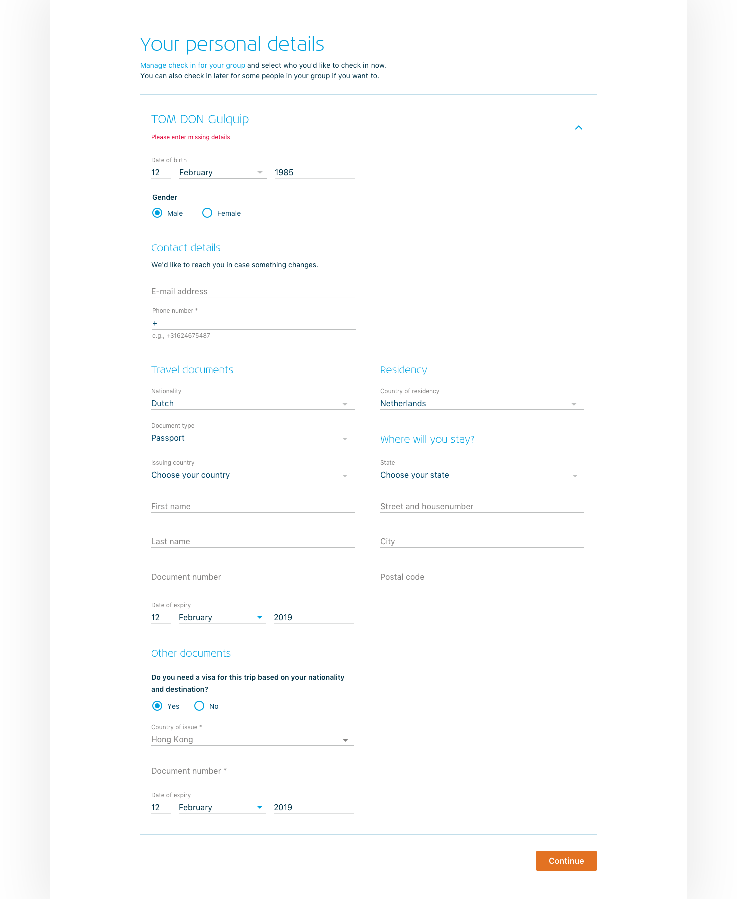
BEFORE
As a first attempt we've made an accordion to allow focus on an entry for one passenger at a time. We've also included the status of the document form. And functionality to select 'who to checkin' was moved to a popup.
Such a solution was quite bulky and as a result very overwhelming. Although having an overview in 1 screen it was challenging to easily deal with several passengers, users were missing fields and could not find where they can manage people 'who to check-in'.
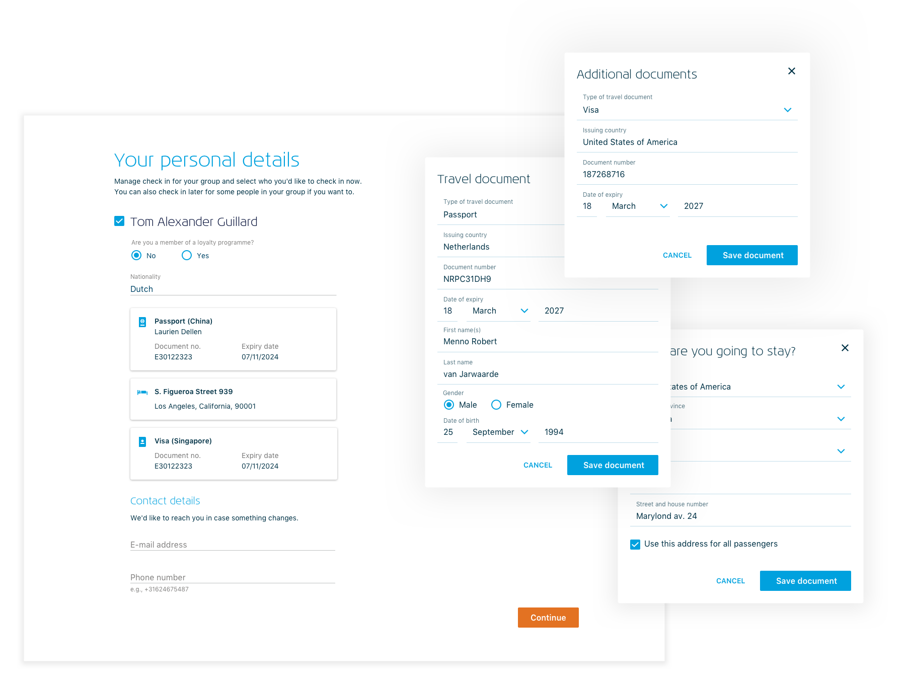
AFTER
We've split each document to a separate popup window, which allowed users to focus while entering details of every single document and yet having a clear overview of all the entered detailed on the same screen without overwhelming with a fence of input fields.
Management of a check-in group was done via check boxes, which was possible since the accordion was solved with document cards.
